
 Stilton, the Chief Pongo at the General Medical Council, is pleased. In 2010, his Gestapo took on more cases, and spiked more doctors than ever before. His network of field spies, the Herr Medical Directors soon to be mantled Responsible Officers, are reporting ever greater numbers of medical dissidents to GMC-HQ. Only two years ago, a mass spiking event took place, with the introduction of medical licences to practice. But that mass spike will pale into trivial insignificance next year, when the greatest spike-fest of them all starts. Revalidation is, as they say in managerial and political circles, due to be rolled out, in 2012. Those doctors who manage to escape acute spiking will be rolled over repeatedly by the heavy steam-roller of revalidation. Doctors, once real life and 3D, will find themselves flattened two dimensional cartoon characters, with not even a shadow of their former selves left to relieve the barren new landscape of 360 degree multi-source blowback. Small wonder, then, that Stilton is so pleased.
The report from which much of this grim scenario was lifted is the engagingly titled “The state of medical education and practice in the UK 2011’, published recently by Stilton’s goons (with additional Fitness to Practice data here). It is a report to put the chill in the Horlicks right enough, but it does nevertheless contain some interesting, in the Chinese manner of being interesting, information: indeed Stilton is to be congratulated for putting it in the public domain. One item that caught Dr No’s eye was figure 8 (page 25), which presents, in graphical form, distribution data on the ‘age of doctors on the medical register by gender (2010)’.
Putting aside the curious presentation – the smoothed line doesn’t really make any sense when you think about it, but then Dr No supposes that’s what happens when you let goons loose with reports – the first thing that struck Dr No was the visual impression of the so-called central tendency (mean and/or median) of the age distribution of registered doctors. Had you asked Dr No, or, as Dr No did, ask a small sample of individuals what they thought these statistics might be, most come up with something in the mid-forties – doctors qualify in their twenties, and retire after forty years in their sixties – so something in the mid-forties makes sense. In fact the true figure is notably lower, all the more so when the correct statistic is used.
Stilton’s goons quote average (mean) ages, 42.3 for men and 36.8 for women (39.9 for both sexes, mode 33), but for skewed distributions, as these are, the median is usually a better measure of the central tendency. Using data derived by a bit jiggery pokery from figure 8, Dr No estimates the median age to be 36, for both men and women – almost a full decade less than a casual off the top of the head mid-forties estimate.
Having done the jiggery pokery and got an estimate of the underlying data, Dr No was in a position to re-chart it in a more conventional format for age-sex distributions: the aptly named population pyramid. He has cross checked the figures, and they do add up, near enough; and this is what it looks like (ages would normally be grouped by five year bands (and the chart vertically compressed) but Dr No has left them as they are to allow visual verification against figure 8):
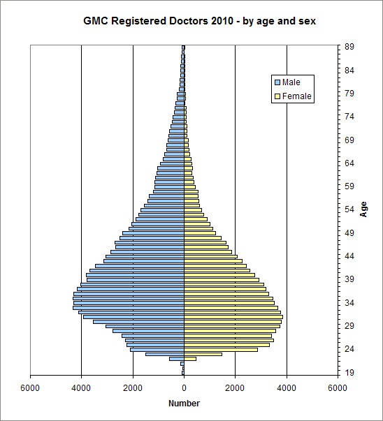
Now, those who are au fait with their population pyramids will recognise this pattern only too clearly. Apart from a minor anomaly at the base, it is the shape one sees with a high birth rate (qualification in our case), a short life, and early death (exit from the register in our case). Most doctors, it seems, have short professional lives – and Dr No can’t help wondering, sorry ones, which leads them to exit early – and so a short life, and a sorry one.
Footnote on jiggery pokery: Dr No used a graphical program to estimate (using pixels as units) the length of the likely bar for each discrete age/sex ‘bin’ from figure 8, and then used Excel to plot that data as a population pyramid. And yes – he should most certainly get out more often.